Part 2 A quick start
NOTE: For now, you can utilize a function called quick_analysis to achieve data conversion, processing and visualization on large datasets easily and straightforwardly (more information is available in “Part 3 Advanced tips”). But before that, I recommend walking through this section and the example code to learn how cookiemilk works at each step.
NOTE: In this tutorial, I assume that you have a basic knowledge of Graph Theory (i.e., you know the concepts like graph, network, node, edge, centrality, etc.) and you are familar with Knowledge Structure studies such as research works from Roy Clariana, Dirk Ifenthaler and Pablo Pirnay-Dummer. The theoretical knowledge would not be introduced here. Instead, the purpose of this tutorial is to help you to understand how to use cookiemilk for data processing.
2.1 Step 1 Load data
First, you’ll need to import the package
import cookiemilk
2.1.1 Load a concept map from a file
For a concept map in the proposition format (i.e., edges are unweighted, which means the values of edges are 1 or 0), we can load it by using the function cmap2graph when setting the argument data_type='proposition'. To do this, the data should be arranged in a way like this:
beeswax minerals
bees figure 8
nectar bees
water beeswax
figure 8 sun
fruit trees nectar
shake distance
minerals nectar
distance abdomen
evaporation nectar
hive nectar
hive house bees
figure 8 shake
water evaporation
dry evaporation
abdomen figure 8
dry house bees
honey house bees
We can save such kind of content in a .txt file called “bees_student_cmap_en.txt”:
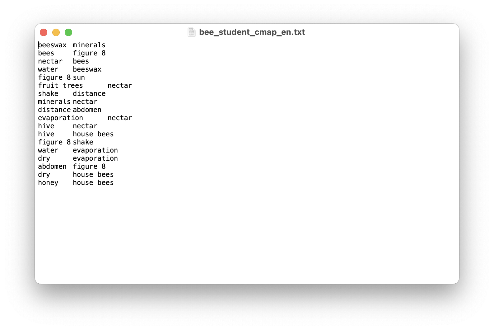
Then we can use cmap2graph to load and convert it into a graph.
bees_cmap = cookiemilk.cmap2graph(data='bees_student_cmap_en.txt', data_type='proposition')
2.1.2 Load a concept map via code
We can also load data through coding. For example, the concept map data above can be saved as a list object in Python and be loaded like this. This is convenient if you only want to test a single case. To do this, we need to set the argument read_from_file=False.
my_cmap = [['beeswax', 'minerals'],
           ['bees', 'figure 8'],
           ['nectar', 'bees'],
           ['water', 'beeswax'],
           ['figure 8', 'sun'],
           ['fruit trees', 'nectar'],
           ['shake', 'distance'],
           ['minerals', 'nectar'],
           ['distance', 'abdomen'],
           ['evaporation', 'nectar'],
           ['hive', 'nectar'],
           ['hive', 'house bees'],
           ['figure 8', 'shake'],
           ['water', 'evaporation'],
           ['dry', 'evaporation'],
           ['abdomen', 'figure 8'],
           ['dry', 'house bees'],
           ['honey', 'house bees']]

student_cmap = cookiemilk.cmap2graph(data=my_cmap, data_type='proposition', read_from_file=False)
2.1.3 Load a matrix from a file
We can load a matrix when setting the argument data_type='array' (this matrix can be seen as a weighted graph). For example, here is a matrix data that we want to load. This data was exported from the software JRateDrag, which is used in the literature to conduct the sorting task to measure students’ knowledge structure. The matrix is in a .prx file, but it can be read as the same as a .txt file.
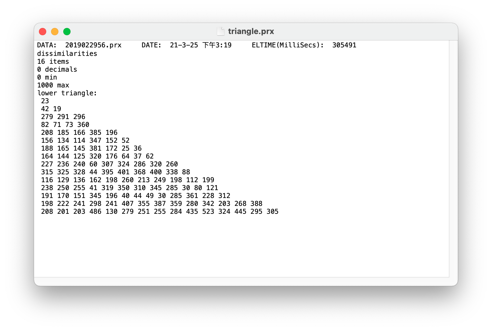
Let’s take a look at the data’s information and then adjust the settings. This is important because improper settings can lead to inaccurate results.
First, this is a distance matrix, where the values represent dissimilarities. We need to set the argument pfnet=True to use the pathfinder algorithm to convert weighted graphs like this into a PFNet, which is an undirected and unweighted graph that only contains a few edges. The input matrix for the pathfinder algorithm should be a dissimilarity matrix, which matches the nature of this example data, so there is no need for additional matrix transformation. Therefore, you can keep the default settings for the argument max and min. These two arguments are also used to define the value range, similar to their function in the JPathfinder software, but generally, they can be left unspecified as all values fall within the expected range in most cases. By the way, the input data can be either a full matrix or a triangle matrix (the example here is a triangle one), but we do not need to worry about that, because the function cmap2graph will do the matrix transformation automatically when it is necessary.
Second, we only need to load the matrix, so the information at the beginning of the file is unnecessary. Therefore, we should set the argument read_from=7 to read the file from line 7, which is the start of the matrix (NOTE: in Python, the first line is line 0).
Third, we need to define a list of key concepts in the appropriate order (see key_terms below).
Now, here is the code.
key_terms = ['beeswax', 'sun', 'nectar', 'house bees', 'water', 'distance',
            'hive', 'shake', 'honey', 'abdomen', 'figure 8', 'minerals',
            'bees', 'evaporation', 'dry', 'fruit trees']

triangle = cookiemilk.cmap2graph(data='triangle.prx', data_type='array', key_terms=key_terms,
                                 read_from_file=True, read_from=7, pfnet=True, max=None, min=None)

cookiemilk.draw(triangle)
And this is what we got.
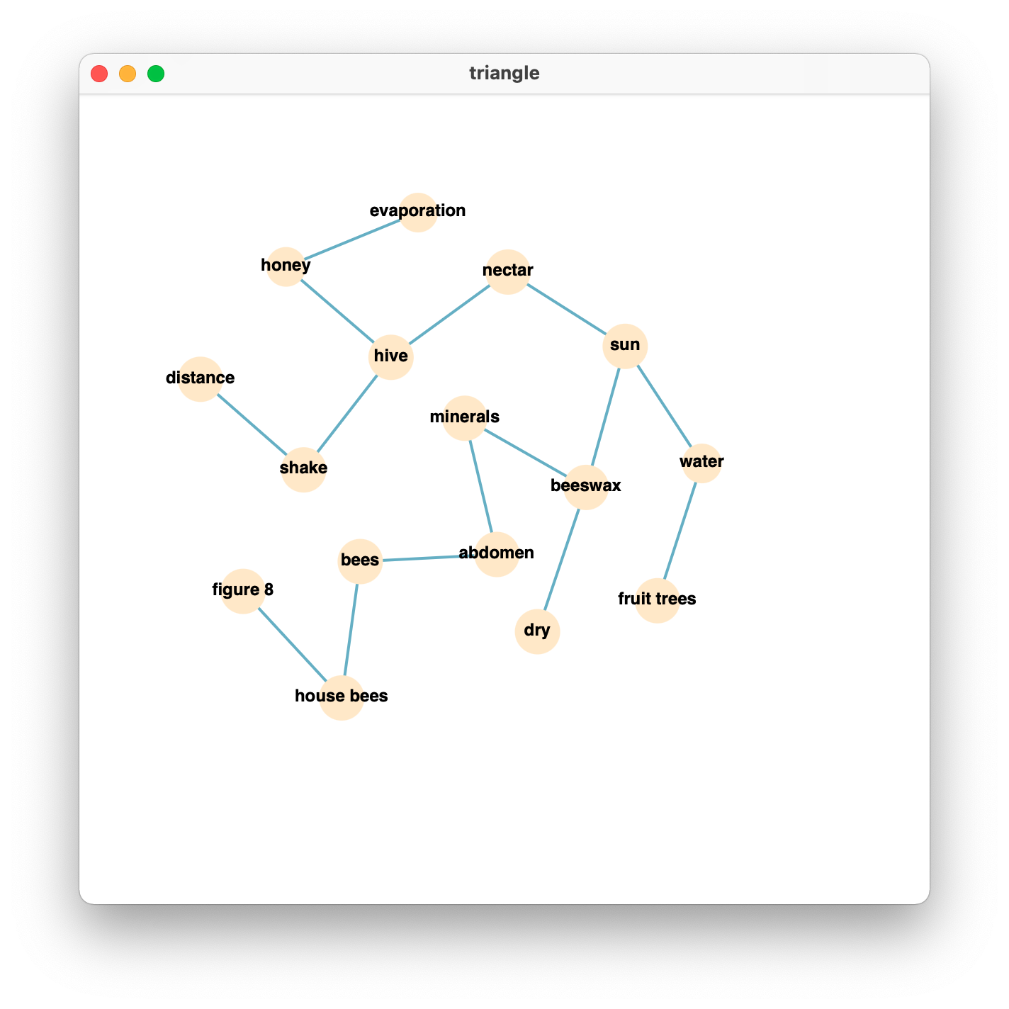
We can also take a look at what the PFNet looks like if we do the same thing via the JPathfinder software. We can find that the graph is the same.
2.1.4 Load a matrix via code
It is possible, but I do not recommend this way unless you want to debug or test something.
2.1.5 Load a text from a file
For example, we have a document derived from the PISA reading test, the title of this document is Collecting Nectar. We can load it via the function text2graph.
To do so, we need to provide the key terms in the text by defining a list object in Python (see key_terms below).
key_terms = ['beeswax', 'sun', 'nectar', 'house bees', 'water', 'distance',
            'hive', 'shake', 'honey', 'abdomen', 'figure 8', 'minerals',
            'bees', 'evaporation', 'dry', 'fruit trees']

my_data = cookiemilk.text2graph(data='bee_text.txt', key_terms=key_terms, as_lower=True)
NOTE: if the text is written in English, I strongly recommend you to provide terms in lowercase and set the argument as_lower=True. When the argument as_lower=True (the default setting), it will convert all of the words in the text to lowercase, so that all key terms can be identified correctly.
NOTE: if there are synonyms in the text, try to use the argument synonym in the function text2graph. You can find more details about it on the page of this function.
NOTE: When creating the key-term list, it’s important to place smaller words at the end of the list if there are larger words containing smaller ones. For example, a text includes three key-terms called “the great waterfall”, “waterfall” and “water”. In this case, the term “waterfall” contains all the five characters in the term “water”, and the term “the great waterfall” contains characters in “waterfall” and “water”, so we need to define the key-term list like ket_term = ["the great waterfall", "waterfall", "water"], which enables the bigger words being identified before the smaller ones (e.g., the string “the great waterfall” would not be identified as the term “water”).
2.1.6 Load a text via code
We can also load this text from a string object in Python directly.
text = 'Bees make honey to survive. It is their only essential food. If there are 60,000 bees in a hive about one ' \
       'third of them will be involved in gathering nectar which is then made into honey by the house bees. A small ' \
       'number of bees work as foragers or searchers. They find a source of nectar, then return to the hive to tell ' \
       'the other bees where it is. Foragers let the other bees know where the source of the nectar is by performing ' \
       'a dance which gives information about the direction and the distance the bees will need to fly. During this ' \
       'dance the bee shakes her abdomen from side to side while running in circles in the shape of a figure 8. The ' \
       'dance follows the pattern shown on the following diagram. The diagram shows a bee dancing inside the hive on ' \
       'the vertical face of the honeycomb. If the middle part of the figure 8 points straight up it means that bees ' \
       'can find the food if they fly straight towards the sun. If the middle part of the figure 8 points to the ' \
       'right, the food is to the right of the sun. The distance of the food from the hive is indicated by the length ' \
       'of time that the bee shakes her abdomen. If the food is quite near the bee shakes her abdomen for a short ' \
       'time. If it is a long way away she shakes her abdomen for a long time. When the bees arrive at the hive ' \
       'carrying nectar they give this to the house bees. The house bees move the nectar around with their mandibles, ' \
       'exposing it to the warm dry air of the hive. When it is first gathered the nectar contains sugar and minerals ' \
       'mixed with about 80% water. After ten to twenty minutes, when much of the excess water has evaporated, ' \
       'the house bees put the nectar in a cell in the honeycomb where evaporation continues. After three days, ' \
       'the honey in the cells contains about 20% water. At this stage, the bees cover the cells with lids which they ' \
       'make out of beeswax. At any one time the bees in a hive usually gather nectar from the same type of blossom ' \
       'and from the same area. Some of the main sources of nectar are fruit trees, clover and flowering trees. '
And here is the code.
key_terms = ['beeswax', 'sun', 'nectar', 'house bees', 'water', 'distance',
            'hive', 'shake', 'honey', 'abdomen', 'figure 8', 'minerals',
            'bees', 'evaporation', 'dry', 'fruit trees']

bees_text = cookiemilk.text2graph(data=text, key_terms=key_terms, as_lower=True, read_from_file=False)
2.2 Step 2 Graph-based features calculation
For example, we can calculate the propositional similarity between bees_text and bees_student mentioned above by using the function calc_tversky.
cookiemilk.calc_tversky(bees_text, bees_cmap, comparison='propositional')
The result shows that the propositional similarity between these two graphs is 0.3137.
For detailed information on propositional similarity and other calculations, see the section “Functions”.
2.3 Step 3 Visualization
We can draw and save a graph via the function draw, which will draw the graph using “D3.js” (a Javascript tool for data visualization) and display it by “pywebview” (a Python package to establish web windows). Let’s take a look at the above example bee_cmap.
cookiemilk.draw(bee_cmap)
Result:

NOTE: if you can not obtain the visualized graph via the above code, one possible reason is that the package “pywebview” does not work in the correct way on your computer. An alternative plan is to save the visualized graph directly rather than show it in a pywebview window. To do this, you can use cookiemilk.draw(bee_cmap, show=False, save=True, filename='bee_cmap').
2.4 Step 4 Average graph
If we are conducting a behavioral experiment, one of the possible analyses that we may want to do is to check how graphs differ between groups. Such a descriptive analysis can be done by generating average networks at the group level via the function average_graph.
Here is an example, I will show you how can we generate an average graph based on data from three students. As shown below, different students used different key-terms in their concept maps. Student1 used the terms “A”, “B”, “C” and “D”; Student2 used the terms “B”, “C”, “E” and “F”; Student3 used the term “A”, “C”, “D” and “G”. All of them construct three links based on their own key-terms.
# example data
cmap_student1 = [['A', 'B'], ['B', 'C'], ['C', 'D']]
cmap_student2 = [['F', 'B'], ['F', 'C'], ['F', 'E']]
cmap_student3 = [['A', 'G'], ['G', 'C'], ['G', 'D']]

student1 = cookiemilk.cmap2graph(data=cmap_student1, data_type='proposition', read_from_file=False)
student2 = cookiemilk.cmap2graph(data=cmap_student2, data_type='proposition', read_from_file=False)
student3 = cookiemilk.cmap2graph(data=cmap_student3, data_type='proposition', read_from_file=False)
To use the function average_graph, we need to include three students’ graphs in a list object, and we also need to provide all of the key-terms.
# arrange data
data = list([student1, student2, student3])

key_terms = ['A', 'B', 'C', 'D', 'E', 'F', 'G']
In general, average_graph works as the following steps. First, each graph will be represented as an n×n matrix (n = the number of key-terms). Each value in the matrix will be 1 or 0, with 1 = ‘connected’ and 0 = ‘unconnected’. Second, a mean matrix based on all matrices will be defined and converted to a graph. Third, the average graph will be converted to a PFNet if the argument PFNet=True. Finally, if the argument n_core is an integer, for example, 4, an average network containing only the four most important key-terms and related links will be returned. If the argument n_core is False (i.e., the default value), an average network containing all key-terms and related links will be returned.
Now, I will show you three approaches to generating average networks. Note that I only recommend the first and the second approach, and the third approach is just shown for the explanation. The first approach (which results in average1) generates an average PFNet containing all key-terms. The second approach (which results in average2) generates an average PFNet BUT only containing the four most important key-terms and related links. The third approach (which results in average3) generates an average non-PFNet graph with weighted edges.
# average
average1 = cookiemilk.average_graph(data=data, key_terms=key_terms, n_core=False, pfnet=True)
average2 = cookiemilk.average_graph(data=data, key_terms=key_terms, n_core=4, pfnet=True)
average3 = cookiemilk.average_graph(data=data, key_terms=key_terms, n_core=False, pfnet=False)

import networkx as nx
import matplotlib.pyplot as plt
from matplotlib.pyplot import figure

figure(figsize=(15, 5), dpi=100)

plt.subplot(231)
plt.title('Student1')
p1 = nx.draw(student1, with_labels=True)

plt.subplot(232)
plt.title('Student2')
nx.draw(student2, with_labels=True)

plt.subplot(233)
plt.title('Student3')
nx.draw(student3, with_labels=True)

plt.subplot(234)
plt.title('average PFNet')
nx.draw(average1, with_labels=True)

plt.subplot(235)
plt.title('average PFNet containing four most important terms')
nx.draw(average2, with_labels=True)

plt.subplot(236)
plt.title('weighted average graph')
pos = nx.spring_layout(average3, k=10)  # For better example looking
nx.draw(average3, pos, with_labels=True)
labels = {e: round(average3.edges[e]['weight'], 2) for e in average3.edges}
nx.draw_networkx_edge_labels(average3, pos, edge_labels=labels)

plt.show()
Result:
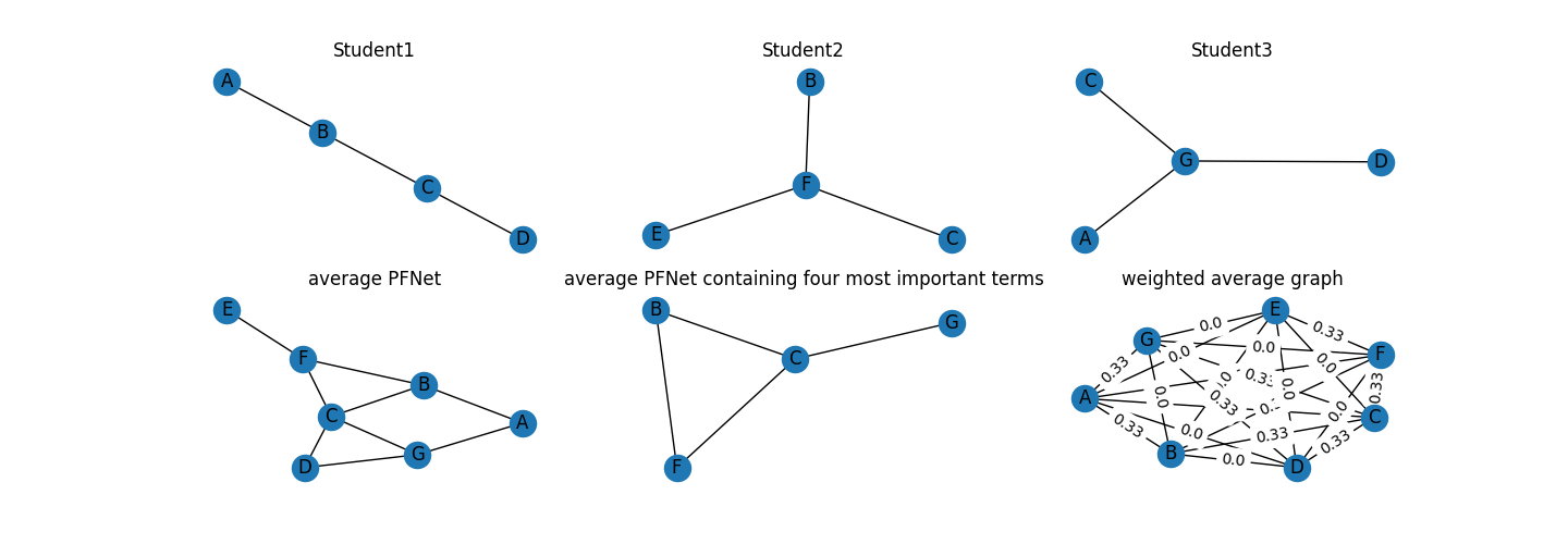
As shown in three students’ graphs (see the top in the above figure), the key-term “B” and “C” are the two most important key-terms in Student1’s graph, the key-term “F” is the most important in Student2’s graph, and the key-term “G” is the most important in Student3’s graph. The first average graph contains all key-terms that appear in three students’ graphs (i.e., from “A” to “G”, see the bottom-left of the above figure). However, this approach may result in a large graph if the dataset is large and different students used diverse key-terms. One of the possible solutions is to retain only the most important key-terms and related links in the average graph. For doing this, we need to check the node centrality first.
nx.degree_centrality(average1)
Here are the results.
{'B': 0.5, 'A': 0.3333333333333333, 'C': 0.6666666666666666, 'D': 0.3333333333333333, 'F': 0.5, 'E': 0.16666666666666666, 'G': 0.5}
We find that “B”, “C”, “F”, and “G” show the highest node centrality, so we can consider retaining only four nodes in the average graph. Four is also the number of key-terms in each student’s graph, so this number seems appropriate in this case. By setting the argument n_core=4, we obtain the second average graph (see the bottom-middle of the above figure). Note that keeping the size of the average graph is important in some cases because some indices such as graph centrality (GC) only can be used to compare graphs when the graphs are about the same size.
The third average graph contains most of the information in the mean matrix (see the bottom-middle of the above figure), but it was less interpretable. This is why the argument pfnet and n_core are important for generating an average graph.
Finally, we can also use the function draw to show the average network.
cookiemilk.draw(average1)